Newsletter
Financial Wellness Starts Here Here
Section: Infographic of the week
← Curating the web to find the most interesting and helpful
information about your money.
FP Canada™ 2025 Financial Stress Index
FP Canada publishes the annual Financial Stress Index to gain insight into factors causing Canadians financial stress—and the extent to which CFP® professionals and QAFP® professionals are helping them improve their financial well-being.
 The results of the eighth Financial Stress Index reveal that Canadians who work with a financial professional are less stressed about money →
Financial wellbeing is the top challenge faced by employees, yet employers struggle to address this issue
Financial health is the top wellbeing concern for employees, but many employers acknowledge a gap in effectively addressing this issue.
 Findings from the 2024 Wellbeing Diagnostic Survey (Canada) →
So You Want To Be A Millionaire?
Let’s say you’ve decided that one million dollars is your retirement savings goal (not that you’d be opposed to more). Is that a reasonable goal? Is it obtainable for you at this stage in your life? See the image below for an estimate of what you should be saving monthly to retire with one million dollars, based on your savings timeline.
 3 Keys to Becoming a Millionaire →
Daily Travel Budgets for 15 European Countries
European countries are among the most sought-after destinations for tourists worldwide. In 2023 alone, Europe saw over 700 million international tourist arrivals. This map presents the costs of accommodation, food, and transport for tourists in 15 European countries, as compiled by HelloSafe in September 2024. Airfare is excluded.
 Switzerland is the Most Expensive Destination →
Student Budgeting
Save money in school by cooking your own food, renting or borrowing textbooks, using your student discount, and more.
 The Student Money Saver Checklist →
How Much Each Country Pays for Gas in 2025
This map tracks the retail price of gas in 169 countries and territories around the world. Data is sourced from Global Petrol Prices, as of Feb 3rd, 2025. Gas, more commonly known as petrol, is priced per liter in many places. The table in the next section includes the equivalent cost.
 How does Canada compare to the rest of the world? →
Canada's Best Cities for Renters
Some cities across Canada offer a renter’s dream combination of features that make life smoother and more enjoyable. According to a recent survey from Point2Homes, these cities have emerged as top destinations for renters in 2024.
 Canada's top 10 cities for renters in 2024 →
How Canadians spent their money in 2021
If you're creating a budget for the first time, it's important to recognize that budgets will differ from person to person and family to family. You should design a budget that suits your needs. One of the best and easiest ways to manage your money is by using a personalized, real-time budgeting app like Neontra, which automatically generates a 50/30/20 budget.
 Discover how simple it is to track your spending and compare it daily, monthly, or yearly with Neontra →
How the Cost of Netflix Has Increased Over Time
This graphic shows how the price of Netflix plans in the U.S. have increased over time. This data was compiled by Android Authority
 Neontra is the easiest way to track subscriptions, manage bills, and your recurring charges in one place →
Check up on your financial health from the Financial Consumer Agency of Canada
Checking up on your progress in managing and paying down debt is an important part of maintaining your overall financial health.
 Managing and reducing your debt will lead to better financial health →
Visualizing Major Asset Class Returns in 2024
Bitcoin surged to all-time highs, gold saw its best performance in 14 years, and the U.S. dollar rallied thanks to a strong U.S. economy. Meanwhile, the S&P 500 saw its best two-year run in over 25 years. On the flip side, bonds experienced lackluster performance amid reflationary concerns. This graphic shows major asset class returns in 2024, based on data from TradingView.
 Bitcoin and Gold Outperform in 2024 →
Financial Literacy 101: What Every College Student Needs to Know by StudyCorgi
StudiCorgi has put together a list of practical strategies to help college students become more financially savvy and develop a healthy money mindset that lasts well beyond their college years. Their visual guide outlines the benefits of financial literacy and the key principles that will enable young adults to manage their finances effectively.
 Benefits of financial literacy for college students →
The assets, debts and net worth of Canadian families, 2023
In 2023, the median net worth* of Canadian families Note 1 was $519,700. *Net Worth is the amount that families would have left over if they sold all their assets and paid off all their debts
 How do you compare? →
Ranked: Top 20 Countries by Average vs. Median Wealth
Average wealth is the total wealth of a country’s people divided by the size of its population. Also known as a mean average, this measurement can be skewed by extremely high values such as the presence of billionaires.
 Where does Canada rank? How does your wealth compare? →
How holiday spending plans vary across Canada
Canadian consumers plan to spend an average of $1,853 on gifts, travel and entertainment this holiday season, a 13% increase over last year. At the same time, their economic outlook is brightening as inflation and interest rates decline: 65% believe the economy will stabilize or improve over the coming months, up from 48% a year ago.
 Consumer spending in Canada: A season of gifts, gatherings and getaways →
Canadian Housing Market Data from WOWO
Canada’s housing market buzzed with activity in October 2024 during a month with significant home sales and price changes across the country. In October 2024, the national benchmark home price, which measures the price of a “typical” home, was $707,700, a 0.8% monthly decrease and down 3.2% year-over-year. However, it has jumped 77% over the past decade.
 Canadian Housing Market Report →
Ranked: U.S. States vs. G7 Countries by GDP per Capita
This graphic charts the GDP per capita of G7 countries against select U.S. states. Why compare states vs G7? By going down to the state level we account for differences in population and aggregate demand which can mask output inequalities between the U.S. and its peer economies.
 How does Canada compare? →
Visualizing the Decline of the Canadian Dollar
The Canadian dollar has fallen to its lowest level in years. In late October, the loonie dropped below 72 cents USD for the first time since 2020. This graphic highlights the USD to CAD exchange rate from 2004 to 2024, based on data from the Bank of Canada Daily Noon Exchange Rate.
 Over the last 20 years, the Canadian dollar has experienced notable fluctuations →
Ranked: The Top 25 Countries for Retirement
In 1881, Otto von Bismarck proposed a radical idea for retirement: people above the age of 70 would be given a state pension, encouraging them to stop working. This model has since been adopted en masse and most countries now have a retirement age, after which workers can claim benefits paid through years of their work.
 Where does Canada rank? →
Mapped: Fastest Growing (and Shrinking) Cities in the U.S. and Canada
Despite Canada having a population just 12% the size of the United States, the country was home to a majority of the fastest-growing cities between the two neighbouring countries.
 Toronto is the Fastest-Growing City in Canada and the U.S. →
Ranked: Canada’s Housing Markets, by Price Growth in 2023
Between 2010 and 2022, real Canadian housing prices jumped 90%, making Canada one of the most expensive and unaffordable housing markets in the world.
 The Visualcapitalist maps the average price of housing across Canada’s provinces and territories in 2023 (excluding Nunavut), based on data from the Canada Real Estate Association (CREA) →
Global Real Estate Bubble Index 2024
This graphic shows real home price growth in real estate bubble markets over the last decade
 Where do Canadian cities rank? →
Which States Have The Highest Share of Retirement-Age Workers?
About 22% of American adults 65 and older continue to work in 2024. Growth in the 65 and older population, higher cost of living and other factors have led to a large share of older adults in the workforce. New Jersey saw the highest share of working adults over the age of 65 in 2024, and the largest two-year increase.
 Retirement-Age Adults Still Working by State →
Charted: The Most Popular Investing Strategies, by Generation
When it comes to investing, each generation has their own mix of strategies, and younger generations like to try a bit of everything.
 How Do Different Generations Invest Their Money? →
Ranked: Countries by Wealth Disparity Changes (2008–2023)
A recent US Federal Reserve analysis found that from 2019 to 2022, low-wealth groups in America had larger percentage gains in wealth compared to their high-wealth counterparts.
 How Wealth Inequality Has Changed Since 2008, by Country →
Charted: Average Wage Growth in G7 Countries (2000-2022)
Average wage growth is a key sign of how well a country’s economy is doing. When wages rise, it typically signals that businesses are thriving and can afford to pay their employees more, which in turn boosts consumer spending and stimulates further economic growth.
 How does your wage growth compare? →
The Challenge That Financial Vulnerability Brings to Canadians
Financial vulnerability and financial stress are mainstream issues affecting Canadians of all income levels and in particular more vulnerable populations.
 Free Financial Resilience Score Tool →
In 15 big Canadian cities, more than 50% of homes sell for at least $1 million.
Beyond conventional criteria — such as a $1 million+ price tag, spaciousness, lavish decor, and a prime location — lie deeper insights into the fabric of the markets that showcase Canada’s most expensive homes for sale.
 Check out the 15 large cities where 50% to 80.5% of homes for sale cost at least $1 million →
British Columbia is the Most Expensive Province in Canada to Live by the visualcapitalist
This graphic ranks the Canadian provinces by their cost of living, represented by an index made up of 55 contributing factors.
 British Columbia (BC) and Ontario are Canada’s most expensive places to live by a significant margin →
The Countries With the Highest Wealth per Person
In 2023, global wealth increased by 4.2% as global stock markets rebounded and inflation eased. While Europe, the Middle East, and Africa achieved the strongest wealth growth, the U.S. accelerated at roughly half the rate of these regions, at 2.5% annually.
 Highest average wealth per person, by country. Where does your Canada rank? →
Where Are Salaries the Highest?
Broadly speaking, average salaries are going to be higher in countries with a higher cost of living. For example, Switzerland is one of the most expensive countries to live in, with monthly living costs of $2,497 USD according to World Population Review.
 The average annual salaries of OECD countries →
Vanguard finds Canadians’ 50% allocation to home market higher than the recommended 30% Posted By Jonathan Chevreau
A just-released study from Vanguard Canada on Home Country Bias shows that Canadians have about 50% of their portfolios allocated to Canadian equities: well beyond what is recommended for a country that makes up less than 3% of the global stock market.
 Too much Canada in your portfolio can be volatile →
How Much You Need to Earn to Afford a House in Each Major Canadian City in 2024
According to the CREA, the national average home price reached $698,530 in March 2024, a 2 per cent increase year over year.
 The Cost of Canadian Home Ownership in 2024 →
The World’s Least Affordable Housing Markets in 2024
Many cities around the world have become very expensive to buy a home in, but which ones are the absolute most unattainable?
 Impossibly unaffordable cities, where does your city rank →
Ranked: Countries With the Most Millionaires and Billionaires
This graphic lists the top 12 countries by number of high net worth individuals (HNWIs). An HNWI is someone with liquid investable wealth of $1 million USD or more.
 Where do the wealthy live? →
FP Canada™ 2024 Financial Stress Index
The 2024 Financial Stress Index reveals that money continues to be the top stressor for Canadians (44%), steadily increasing from 2023 (40%) and 2022 (38%)
 Year-over-year, the Financial Stress Index shows that working with a financial professional, such as a CFP® professional or a QAFP® →
Charted: The Death of Cash Transactions Around the World
As credit cards and digital wallets (e.g. Apple Pay, Paytm, Alipay) see increasing adoption around the world, the share of cash being used in transactions is plummeting. The chart above looks at cash as a share of transaction value in selected countries at three time periods (2019, 2023, and 2027P).
 Cash Transactions are Becoming More Rare Around the World →
Visualized: How Long Can Each Generation Survive Without Income?
The Visual Capitalist has partnered with Lloyd’s Register Foundation to explore economic resilience further and determine how long the average person can afford to cover their needs without income.
 How long survey respondents could afford to cover basic needs if they lost all income →
Mapped: Federal Tax Paid Per Capita Across Canada
Which parts of Canada pay the most personal tax? In 2021, according to the latest available data, people in Ontario paid by far the greatest share: 42% of the total. Of course, Ontario is also the most populated province.
 Which parts of the country paid the most and least taxes →
Visualized: The Growth of Clean Energy Stocks
Over the last few years, energy investment trends have shifted from fossil fuels to renewable and sustainable energy sources. Long-term energy investors now see significant returns from clean energy stocks, especially compared to those invested in fossil fuels alone. For this graphic, Visual Capitalist has collaborated with EnergyX to examine the rise of clean energy stocks and gain a deeper understanding of the factors driving this growth.
 The Growth of Clean Energy Stocks →
Overdraft Protection: What your bank doesn't want you to know
Nobody wants the embarrassment of seeing their debit card declined. To help, bankers came up with a seemingly beneficial solution. Overdraft protection is a service that allows card users to pay for items even if they temporarily do not have the funds, and it can help consumers potentially avoid such awkward problems. However, what seemed like a good idea may have been taken too far: and now, overdraft protection is a key source of profits for banks.
 How overdraft protection works, and why it tends to hurt consumers more than it helps →
Visualizing the extraordinary power of compound interest by the Visualcapitalist
The power of compound interest is so compelling, that it’s been often called the “eighth wonder of the world”. Find out why this concept is so fundamental to personal finance in the following infographic:
 The power of compound interest →
Navigating the personal finance landscape requires skills or knowledge in the following foundational areas
Personal finance isn’t just about dollars and cents. The reason it’s so hard to master? It’s actually a multi-disciplinary field that requires foundational skills ranging from psychology to negotiation.
 Navigating the personal finance landscape requires skills or knowledge in the following foundational areas →
Mapped: The Income a Family Needs to Live Comfortably in Every U.S. State by the Visual Capitalist
This was originally posted on the Voronoi app. Families in the top five most expensive U.S. states require an annual income exceeding $270,000 to live comfortably. This visualization illustrates the income necessary for two working adults with two children to maintain a comfortable lifestyle in each state.
 The income a family needs to live comfortably in every U.S. State →
Visualizing America’s Average Retirement Savings, by Age
Painting a concerning picture, the median retirement savings for Americans stands at a mere $87,000, a figure far lower than what is needed for a comfortable nest egg. This savings gap—the amount people have actually saved versus what they believe is needed for retirement—is significantly rising. In fact, a recent survey from Northwestern Mutual reveals that $1.46 million is the ideal savings target for retirement, up from $1.27 million last year.
 America’s Average Retirement Savings, by Age →
The Top 5 Reasons People Hire a Financial Advisor
From saving for a down payment to planning for retirement, clients turn to advisors to guide them through life’s complex financial decisions. However, many of the key reasons for hiring a financial advisor stem from emotional factors and go beyond purely financial motivations.
 Investors' motivations for working with an advisor go beyond financial reasons →
Charted: Who Has Savings in This Economy?
The Visualcapitalist visualises the percentage of respondents to the statement “I have money leftover at the end of the month” categorized by age and education qualifications. Data is sourced from a National Endowment for Financial Education (NEFE) report, published last month.
 The Impact of Higher Education on Earnings and Savings →
Where Does One U.S. Tax Dollar Go?
Come tax season, a common refrain is: “what do my taxes even pay for?” To answer that question, we visualized U.S. federal government spending by function, referencing expenditure to a single federal tax dollar. Data is for the fiscal year ending September 30, 2023 from the U.S. Bureau of the Fiscal Service. Total spending amounts are converted to cents on the dollar and percentages, to show where one tax dollar goes.
 Major Areas of U.S. Government Spending →
Visualizing the Growth of $100, by Asset Class
Which major asset class has generated the strongest returns over the long run? How do the returns of investments like bonds and real estate actually stack up? To put investment returns in perspective, this graphic shows the growth of $100 by asset class over the long term, based on data from Aswath Damodaran at NYU Stern.
 Comparing Asset Class Returns →
A Map of Global Happiness By Country in 2024
Happiness, like love, is perhaps one of the least understood and most sought-after emotions and experiences in human life. And while many inspiring teachings exist about attaining individual happiness, it’s worthwhile to consider how happy entire countries are on a collective scale.
 A Map of Global Happiness By Country in 2024 →
Who Expects to Get Richer in 2024, by Both Generation and Gender
The Visualcapitalist plots the percentage of high net worth individual (HNWI) respondents who expect their wealth to increase in 2024, categorized by generation and gender, from the Knight Frank Next Gen Survey, accessible in their latest wealth report.
 Who Expects to Get Richer in 2024, by Generation and Gender →
Chart: The Declining Value of the U.S. Federal Minimum Wage
This graphic illustrates the history of the U.S. federal minimum wage using data compiled by Statista, in both nominal and real (inflation-adjusted) terms. The federal minimum wage was raised to $7.25 per hour in July 2009, where it has remained ever since.
 Nominal vs. Real Value of the U.S. Federal Minimum Wage →
Decision Paralysis: The Rise to One Million Investment Choices
There were just over 30,000 managed investment products in 2002, but the choices grew rapidly in the years that followed. As of June 30, 2023, there were more than 742,000 products available.
 The rise in investment products over time, and how financial advisors can help →
Ranked: What People Value Most in a Financial Advisor
Are advisors putting their focus where it matters? You might think that positive reviews and recommendations would be a top consideration for people choosing a financial advisor. However, other qualities appear to be much more important.
 The Qualities Investors Value in a Financial Advisor →
Charted | The Wealth Needed to Join the Top 1%, by Country
The last decade has witnessed a remarkable surge in the global number of millionaires. By 2022, 1.1% of the world’s adults were millionaires, up from 0.6% in 2012. So, how to know if you belong to the top 1% in your country?
 Wealth Needed to Join the Top 1%, by Country →
Mapped: Inflation Projections by Country, in 2024
While inflation looks to be easing, there remains the risk of a second wave of price pressures driven by geopolitical conflicts and supply disruptions in the Red Sea. Adding to this, a stronger than expected labor market could drive consumer demand, pushing up higher prices. This graphic shows 2024 inflation projections around the world, based on forecasts from the International Monetary Fund (IMF).
 Inflation Projections, by Country in 2024 from the Visual Capitalist →
Mapped: Which is the Best U.S. City for Entry-Level Jobs by Pay?
The anxieties around a first-job are immense: fear of the unknown, performance pressure, and the need to navigate new professional environments. But good pay can help manage these worries. Lots and more has been written on which careers are the highest-paid, but how does geography factor into the equation?
 Ranked: 50 U.S. Cities By Entry-Level Job Pay →
How Much Do Text Message Scams Cost Americans?
The Visualcapitalist visualizes the amount of money that Americans lost from scam text messages in the year 2022. These figures are sourced from reports filed to the Federal Trade Commission (FTC), accessed via USA Facts.
 Type of Text Message Scams by Cost to Americans →
Charted: Investment Preferences by Generation in the U.S.
Different generations grow up with different values and different economic realities, causing investment preferences by generation to vary across the board. The above graphic shows how different generations invest—from millennials to boomers—based on June 2023 survey data from Charles Schwab.
 The Visual Capitalist: Investment Preferences by Generation →
What are people’s biggest financial stressors?
The route to financial happiness isn’t the same for everyone, though 81% of Americans agree that inflation and the rising cost of goods generate the most stress. But different trends emerge when we compare the generations.
 Financial stress is such a challenge that many plan to retire three years later than planned →
The Happiness Index
Across generations, Americans are tending to find happiness in areas other than their finances. The financial situation is especially challenging for Gen Z and X; less than half report being satisfied with their finances.
 How, then, can someone stay on the road to financial happiness? →
How to Reach Financial Happiness
Many Americans believe that you need $1.2 million to reach financial happiness. So, it follows that 71% of Americans feel more money would solve their problems. This leaves us to wonder: how happy are Americans with their finances?
 What makes people financially happy? →
Retirement Planning Mistakes
According to professionals, the most common retirement planning mistakes are time-related, like outliving savings or not understanding how inflation can affect a portfolio over time. The number one mistake? According to 49% of financial planners, its underestimating the sizeable impact inflation has on the value of retirement savings.
 Charted: Top 10 Retirement Planning Mistakes from the visualcapitalist.com →
Visualizing the Global Education Gap
The global education gap refers to disparities in educational access that exist between higher- and lower-income countries. It exists for various reasons, including lack of resources, political instability, and outdated technology.
 The Hinrich Foundation provides visual context to the global education gap →
Tech Giants’ Stock Performance: A Three-Year Review (2020-2023)
In the last three years tech giants like Apple, Google, and Microsoft navigate through market volatility due to the global pandemic. In 2020, the pandemic led to a market selloff, but companies like Zoom and Shopify experienced growth due to increased demand during lockdowns.
 Maureen Okonkwo's Viz at Tableau Public →
Holiday Survival Guide
The winter holiday shopping season is the most expensive time of year for most households. This year, spending is expected to be even higher due to rising prices. This infographic helps you start planning to shop and save for the 2023 holiday season.
 How to plan and save for the 2023 holiday shopping season →
How Americans of Different Generations Spent Their Money in 2021
Most consumer spending falls into the larger categories of food, housing, transportation, healthcare, and other goods and services.
 View the interactive version of this chart highlighting how different generations spend money →
What You Need to Earn to Own a Home in 50 American Cities
Between skyrocketing prices, stagnating wages, and now rising interest rates, the deck seems to be increasingly stacked against home ownership. Using May 2023 data tabulated by Home Sweet Home, the Visual Capitalist maps out the annual salary needed to afford a 30-year mortgage (at 6.37%) to buy a home in America’s 50 most populous metropolitan areas.
 The Least and Most Affordable American Cities to Own a Home →
Visualizing the Pyramid of Global Wealth Distribution
Who controls global wealth? In 2022, the world’s millionaires held nearly half of net household wealth. Decades of low interest rates led equities and real estate values to soar, and these assets are disproportionately held among the world’s wealthiest.
 The distribution of global household wealth, based on the annual 2023 UBS Global Wealth →
Visualizing 30 Years of Investor Sentiment
The link between investor sentiment and the stock market is not linear. In fact, many consider extreme sentiment readings as a contrarian indicator. If sentiment swings sharply in one direction, some investors may consider this a signal to do the reverse.
 Investor sentiment and U.S. stock prices over modern history →
The 20 Most Common Investing Mistakes, in One Chart
No one is immune to errors, including the best investors in the world. Fortunately, investing mistakes can provide valuable lessons over time, providing investors an opportunity to gain insights into investing—and build more resilient portfolios.
 20 Investment Mistakes to Avoid →
Which Cities Have Bubble Risk in Their Property Markets?
Despite higher mortgages and sharply correcting prices, some cities’ property markets are still in bubble-risk territory.
 The UBS Global Real Estate Bubble Index →
Charted: Retirement Age by Country
The retirement landscape can look completely different depending on what country you’re in. And charting the retirement age by country reveals a lot of differences in the the makeup of a labor force, both for economic and cultural reasons.
 Exploring retirement age trends around the globe →
Ranked: Median Student Debt for a U.S. College Degree
According to the Federal Reserve, student loans added up to $1.6 trillion in Q2 2023, making them the third largest category of U.S. household debt behind auto loans ($1.8 trillion) and mortgages ($12 trillion).
 The Visual Capitalist ranks student debt by U.S. college degrees →
Visualizing the Top Countries by Wealth per Person
When looking at wealth per person on a country-by-country basis, is it more important to look at median wealth or average wealth?
 See how you compare to the rest of the world →
Warren Buffett's Portfolio Visualized
Warren Buffet is probably best known for being one of the world’s most successful investors. See what Berkshire Hathaway are holding and learn from the legendary value investor known as the 'Oracle of Omaha'.
 How They Make Money: Why the Oracle of Omaha tends to bet on the status quo →
Who appears on the most currency?
Queen Elizabeth II leads monarchs to the front of 1/3 of the world’s currency, followed by Vajiralongkorn, King of Thailand.
 Monarchs and world leaders appear more frequently than other people →
World Risk Poll: How Long Can People Survive Without Income?
In the wake of natural disasters or economic shocks, a person could quickly be left without income, which is why financial security is such an important aspect of resilience. The Lloyd’s Register Foundation partnered with Gallup and polled 125,000 people from 121 countries, asking how long people could cover their basic needs without income
 How Long Can People Survive Without Income? Assessing Financial Security →
Ranked: The 20 Best Franchises in the U.S.
The U.S. is famous for chain restaurants, franchised shops, and brand name hotels. One thing these franchises aim for is consistency in store feel, customer service, product offerings, and prices, no matter which state you’re in.
 Best franchises in the U.S. worth owning, from Dunkin’ Donuts to ... →
How Long Does it Take to Double Your Money?
At first glance, a 7% return on your investment may not seem that impressive. Yet what if you heard that your money could double in roughly 10 years?
 Why it Pays to Know the Math →
The Monthly Cost of Buying vs. Renting a House in America
With home prices and mortgage rates both rising, the U.S. is now witnessing the biggest numerical gap in the monthly cost between owning a home and renting in over 50 years. Americans, however, have seen similar scenarios occur since the early 1980s.
 See the difference of buying vs. renting a single-family residence in the U.S. since 1970, adjusted for inflation. →
Just 7 Companies Dominate the Nasdaq 100
Launched in 1985, the Nasdaq 100 index tracks the performance of the largest, and most actively-traded, non-financial companies listed on the Nasdaq stock exchange.
 Companies in the Nasdaq 100, by Weight →
Visualizing U.S. Wealth by Generation
The distribution of wealth is an important measure of the economic power of each generation. In the U.S., for example, baby boomers own half of the nation’s $156 trillion in assets despite making up 21% of the country’s population.
 Visualizing $156 Trillion in U.S. Assets, by Generation →
Timing the Market: Why It’s So Hard, in One Chart
Timing the market seems simple enough: buy when prices are low and sell when they’re high.
 The Pitfalls of Timing the Market →
The World’s Biggest Mutual Fund and ETF Providers
The global net assets of mutual fund and ETF providers totalled $38 trillion in 2022. Despite its massive size, the industry is dominated by a relatively small number of brands.
 This graphic uses data from Morningstar to show the largest fund brands and their growth rates in 2022 →
The average monetary value of each type of person
Monarchs and world leaders appear more frequently than other people on the world’s currency. But, since many of them appear on multiple denominations, the average value of their notes and coins is lower than that of historians, mathematicians, and singers.
 How do spies, historians, monarchs and athletes compare? →
Visualizing the Hierarchy of Financial Needs
Behavioural scientist Abraham Maslow wrote “A Theory of Human Motivation” in 1943, arguing that humans worldwide are influenced by a “hierarchy of needs”. This theory organizes human needs across five levels, where needs in the lower end must be satisfied before progressing onto the next level.
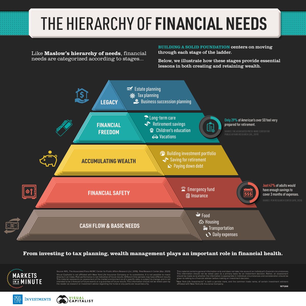 See the steps to creating a strong financial foundation →
Global Distribution of Money
The fact that China, Japan, the United States, Germany, the United Kingdom, France, and India are the nations with the greatest concentrations of this wealth is not surprising. Actually, the combined wealth of just seven nations makes up 69% of the global total.
 Do you know your Net Worth? Start tracking it today →
Visualizing Annual Working Hours
Comparing the number of hours people work in different countries can provide insight into cultural work norms, economic productivity, and even labor laws.
 Where does Canada rank? How do your working hours compare? →
The most profitable U.S. companies, by sector
See the S&P 500 companies with the highest profits in their sector. Data is based on the fiscal year ending on or before January 31, 2023 across companies in the Fortune 500.
 America’s most profitable companies, by sector →
See the Markets in a Minute
S&P 500 companies hold $7.1 trillion in assets, and account for close to 80% of available market capitalization on U.S. stock exchanges. The index serves as a barometer for the U.S. stock market, covering the largest public U.S. companies by market capitalization. Often, it reflects investor sentiment and is considered an indicator for U.S. economic health.
 Visualizing Every Company on the S&P 500 Index →
The Most Expensive Starbucks Items in the World
Your daily coffee habit is probably costing you a lot more than you think. What if you skipped buying two coffees a week and invested that money?
 The Price of (non-essential) Big Bucks Starbucks items in USD →
Ranked: The Cities with the Best Work-Life Balance in the World
"While some careers can be relatively stress-free, maintaining a healthy work-life balance can seem impossible for many. The easy access to technology, blurred boundaries around work and personal time, and fear of job loss push many to work overtime, and fail to use vacation time or sick leave."
 How did Canadian cities measure up? →
The Fastest Rising Asset Classes in 2023
Many corners of the market have shown resilience despite persistent inflation and slowing economic growth in 2023. U.S. equities, international equities, and a variety of bonds have seen positive returns so far this year.
 The top-performing asset classes to date with data from BlackRock →
Charting the Number of Failed Crypto Coins
Ever since the first major crypto boom in 2011, tens of thousands of cryptocurrency coins have been released to market. And while some cryptocurrencies performed well, others have ceased to trade or have ended up as failed or abandoned projects. These graphics from CoinKickoff break down the number of failed crypto coins by the year they died, and the year they started. The data covers a decade of coin busts from 2013 through 2022.
 The Number of Failed Crypto Coins, by Year (2013-2022) →
Just 20 Stocks Have Driven S&P 500 Returns So Far in 2023
Truman Du shows which stocks are making up the vast majority of S&P 500 returns amid AI market euphoria and broader market headwinds.
 Tech and AI stocks have soared as ChatGPT became a household name in 2023 →
How Much Should You Tip In Each Country?
How much should you tip when traveling abroad? The answer can vary wildly depending on the country and what type of service you are using.
 Servers and bartenders depend on tips to supplement wages →
Charting the Relationship Between Wealth and Happiness, by Country
Throughout history, the pursuit of happiness has been a preoccupation of humankind. Of course, we humans are not just content with measuring our own happiness, but also our happiness in relation to the people around us—and even other people around the world.
 Does money really buy happiness? Let’s find out →
How Gen Z Feels About Its Financial Future
Gen Z is an optimistic and driven generation. Many young people in this generational cohort are turning to entrepreneurship and side hustles as a way to supplement their income and build a brighter future.
 Gen Zers have a more positive outlook on their financial well-being than their millennial or Gen X peers →
Mapped: How Global Housing Prices Have Changed Since 2010
Houses fulfill a rare mix of necessity, utility, sentimentality, and for many, also act as a primary investment to build wealth. And it’s that last angle, combined with increasing demand in many countries, that is driving housing prices skyward.
 See how Canada measures up →
How much more are groceries costing you this year?
Mapped: Which Countries Have the Highest Inflation?
 See how Canada compares to the rest of the world →
How much do you spend on your daily coffee?
Mapped: The Price of Starbucks Coffee, by Country
 Do you know how much you spend on daily coffee? See how you compare →